How the Z-Pattern Layout Adds Zing to Your Website (+ Sales)

The era of flashy MySpace-style websites with a kaleidoscope of sections is over (and overwhelming).
In our fast-paced internet world, clarity and immediacy are key, and the Z-pattern layout can help you achieve them… especially when paired up with some badass website copy!
Whether you’ve just read it as ‘zee’ or ‘zed’ in your head, it doesn’t matter: the final result is still the same.
And this zappy pattern can make all the difference on your business website.
Understanding the Z-pattern layout
Before showing you how you can implement it, let me tell you exactly what it is.
What is the Z-pattern?

The Z-pattern is a design that follows the natural route travelled by human eyes when reading: left to right and top to bottom.
Basically, it consists of three parts:
Your eyes will start from the top left of a page and move towards the top right (horizontal line)
Then, they’ll move back to the left side of the page but a bit lower (diagonal line from the top right to the bottom left)
Finally, they’ll repeat the first step (another horizontal line)
If you put these three imaginary lines together, you get a z-shape.
By planning your web design and copy accordingly, you’ll create a smoother flow for your visitors’ eyes, facilitating readability instead of putting them off.
Mind you: the Z-pattern design doesn’t have to be perfectly symmetrical.
In fact, it can include different angles as long as the final result resembles this zig-zaggy letter.
And don’t worry: the website Z-pattern layout is actually much easier to spot once you’ve actually seen one rather than just read an explanation.
While we’ll look at more examples soon, here’s a quick one from my own homepage:
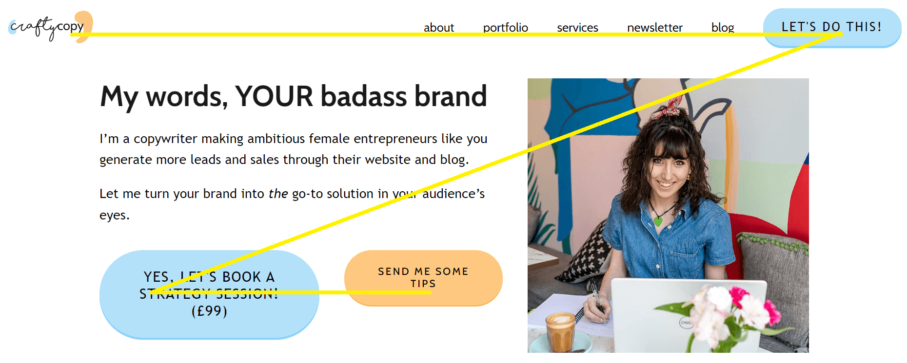
Much clearer, right?
Why is the Z-pattern important?
The Z-pattern layout is important when it comes to websites because it facilitates the reading side of things for your visitors, getting them to focus on exactly what you want them to focus on the most.
This pattern is also what immediately draws their eyes towards your call-to-action buttons rather than the privacy page. Your unique proposition before the explanatory copy.
You get the gist, right?
Ok, but what has the Z-pattern design got to do with website copy, Giada?
Well, the Z-pattern layout per see is worthless if, as well as relevant graphic elements, it doesn’t include copy that will convince the reader to stick around and complete an action!

Just because this pattern helps them focus on the right page items, it won’t work wonders if they feature poorly crafted words like “We pride ourselves in our business solutions”
At the same time, if you have the perfect words for your target audience but they’re scattered all over the place, they won’t be as effective as they could be
Basically, your Z-pattern design and website copy should work together to maximise conversions.
F- and Z-patterns in context
The Z reading pattern layout isn’t the only option. In fact, while it’s the best one in certain cases, you might want to choose the F-pattern in some others.
What the F is an F-pattern?
The F-pattern is the most common way in which people scan larger blocks of content: from left to right, but focusing on the first sentences more and then skim reading the rest.
When it comes to harnessing it on your website, the F-pattern layout involves placing the most important information on top and facilitating readability by having shorter sentences or bullet points on the left towards the bottom.
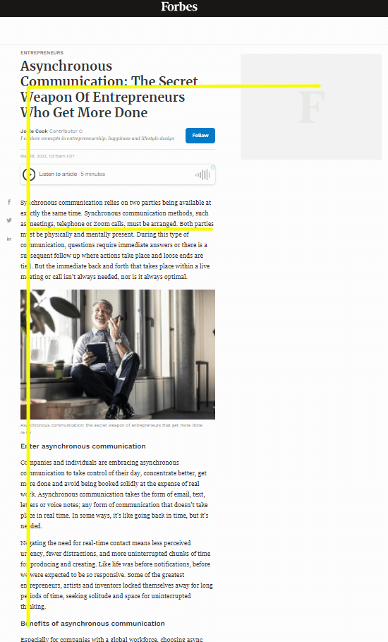
Here’s an example of the F-pattern:
So, when should you use the F-pattern and Z-patterns on your business website?
The F- and Z-patterns are both extremely effective… but only when used right!

The F-pattern is better suited for longer pages and blocks of texts, such as blog posts
The Z-pattern works on pages with less text and that must focus on grabbing someone’s attention immediately instead of overwhelming them with information, such as Home pages and post-click landing pages
More specifically? The website Z-pattern layout is key in the above-the-fold section on these pages.
If you’re not familiar with this term, it’s nothing complicated: it simply refers to everything that your visitors can see before they scroll down.
When they open a new page, that’s what will ultimately make or break the deal, because... if it doesn’t convince them to scroll down, they’ll leave.
In most cases, combining excellent short copy with the Z reading pattern layout is your best chance to capture your audience’s attention immediately.
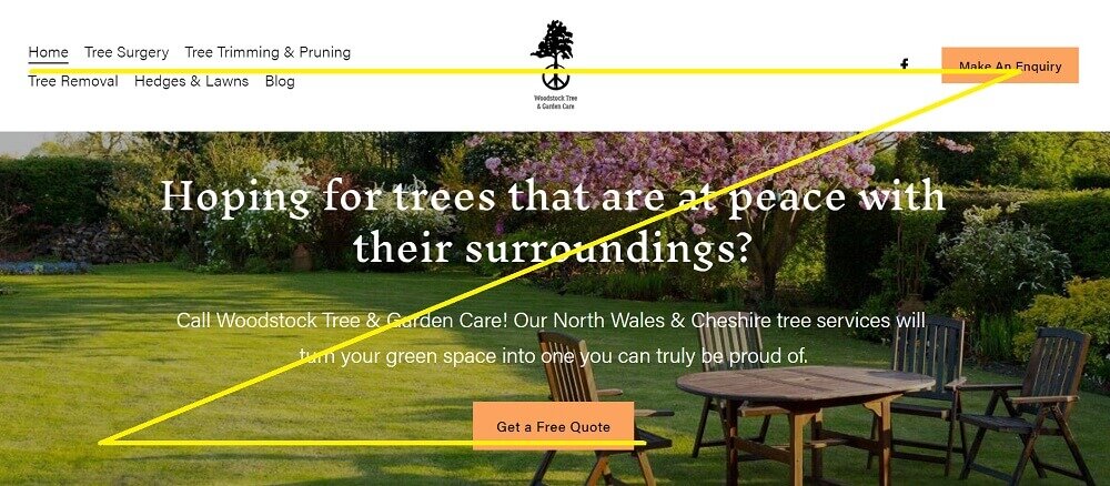
Effective website Z-pattern examples (and a terrible one without it)
Here are a few more screenshots to show you this pattern in action and help you recognise it even when you haven’t got the luxury of finding my little yellow lines.

We immediately focus on the time-sensitive offer and move our eyes towards the CTA button on the right
We see Hello Fresh’s USP in the middle
As well as noticing some mouthwatering food on the left, we end up looking at the other CTA button

In this Z-pattern example, a strong question grabs our attention right from the start
We find out more about what this marketer can do for us
We’re given a clear and unmissable CTA
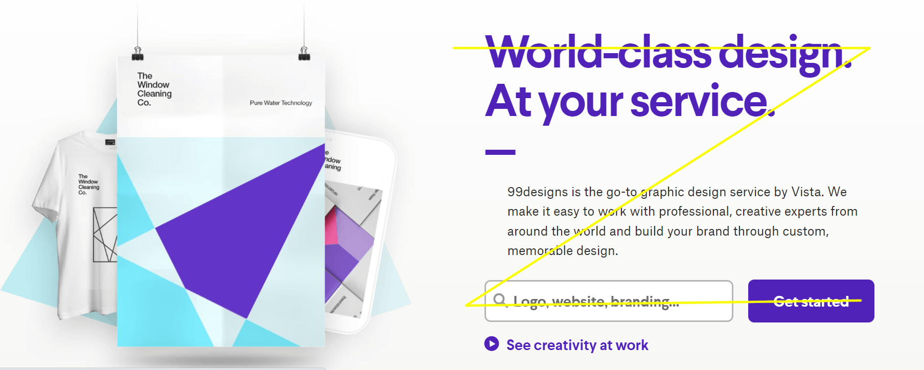
This is an example of how a Z-pattern design doesn’t automatically have to take up the entire width of your web page:
We read a short sentence that grabs our attention…
… move on to this platform’s USP…
… and see an unmissable CTA button
Now, let’s be honest: sometimes we don’t realise how important something is until we lose it, like Ross with Rachel in Friends.
So, here’s what happens when you create a Home page that does NOT harness the Z reading pattern:
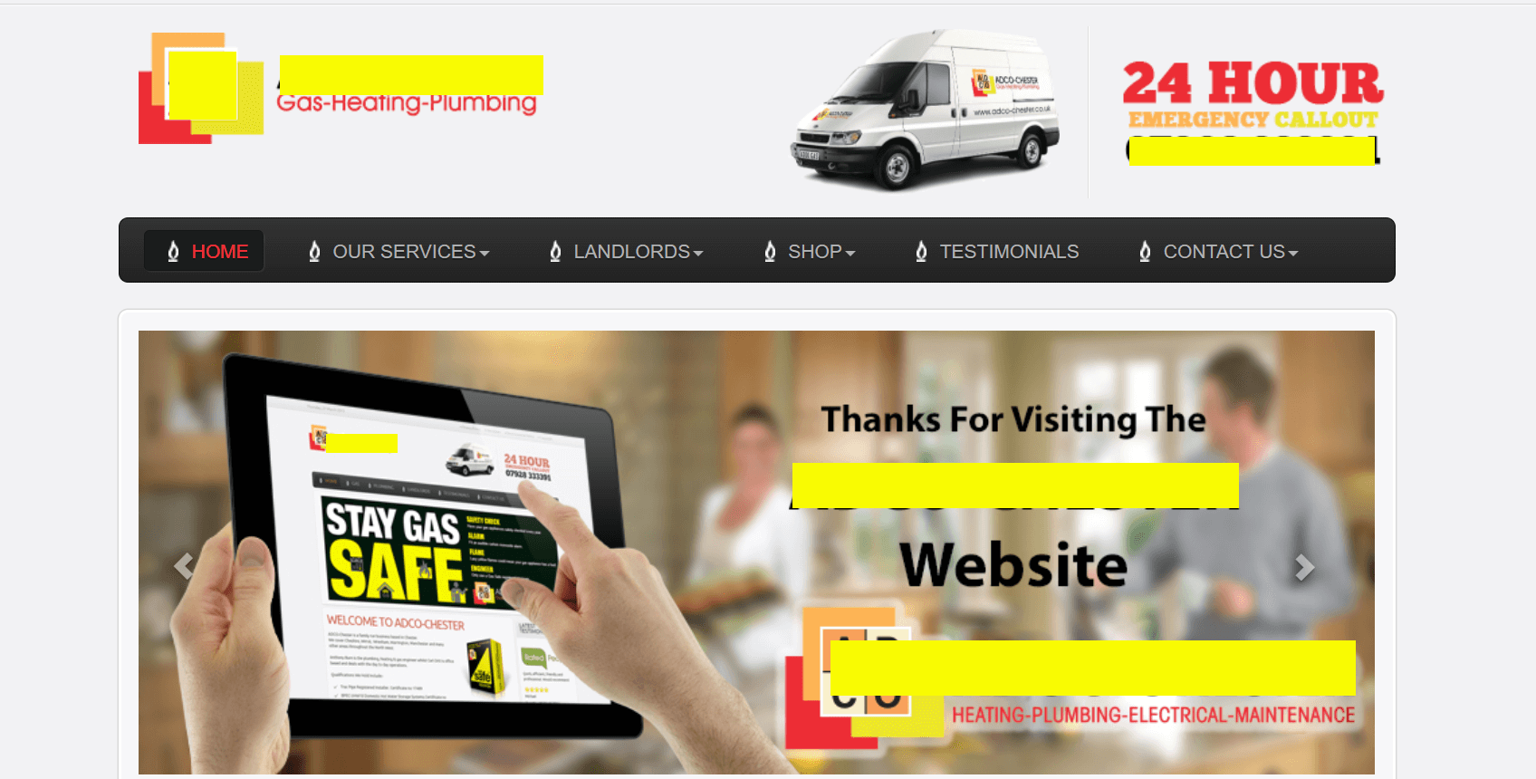
Confusing, right?
Our eyes just don’t know on what we should focus:
The van is quite distracting
Then we see a tablet with a page that looks… just like this actual page
For some reason, we’re being thanked for visiting this page instead of being told what this company can do for us…
… and we’re not given a clear CTA once our eyes get to the bottom right section
Don’t make the same mistake!
How to create an effective z-pattern on your Home and landing pages
So, now that you’ve seen how clean it looks and the difference it makes when it comes to conversions, how do you implement the Z-pattern layout on your own business website?
Here are its three core steps.
Sample of the z-pattern layout on one of my clients’ websites (all words by yours truly)
1. Top horizontal line
For the best results, I recommend placing:
Your logo on the top left, if you can: because that’s where your visitors’ eyes will start their journey, this will help you improve brand recognition
Then, your main navigational menu
At the top right, it’s helpful to have your call to action in a different colour/style from the rest of your menu items: that spot is the equivalent of some extremely precious real estate, so you don’t want to waste it!
Alternatively, depending on your website’s layout, the top horizontal line could consist of a large, attention-grabbing headline.
2. Diagonal line
Here’s where all the build-up towards your call-to-action should happen.
The one or two sentences that immediately convey what you do, who for, and how this benefits them.
3. Bottom horizontal line
That’s the hot spot for your call-to-action!
Depending on the layout of your website, the bottom line of your Z-shape might include some additional explainer copy after your main headline, too.
Still, you can’t forget about the call-to-action: place it towards the bottom right side, right at the end of the second horizontal line.
Now that you know what it looks like, I bet you’ll start seeing this pattern everywhere!
And it’s not a coincidence: that’s simply because implementing the Z-pattern layout is highly fruitful when it comes to convincing your new visitors to stick around and generate conversions.
Need some effective website copy that takes the Z-pattern into account (amongst… a ton of other tricks)? 🔥
Not to sound dramatic, but… after learning the difference that something as (seemingly) trivial as a Z-pattern design can make on your business website, how much are you STILL missing out on?
From clarity to powerful CTAs, your website copy can either confuse your prospects and push them away or impress them, get them to stick around, and convert them into leads and sales.
As a website copywiter & brand messaging consultant, I specialise in writing copy that turns ambitious female entrepreneurs into THE go-to solution in their dream audience’s eyes.

If there was no actual strategy behind the words on your business website, let’s replace them with some audience-oriented and SEO-friendly copy that sets you up for success.
As well as taking the Z-pattern layout into consideration whenever relevant, I’m always more than happy to work with your web designer or existing wireframes.
And, if you haven’t got any just yet, that’s cool: I can create some UX-focused wireframes for your new copy, too.
More #crafty blog posts on this topic


